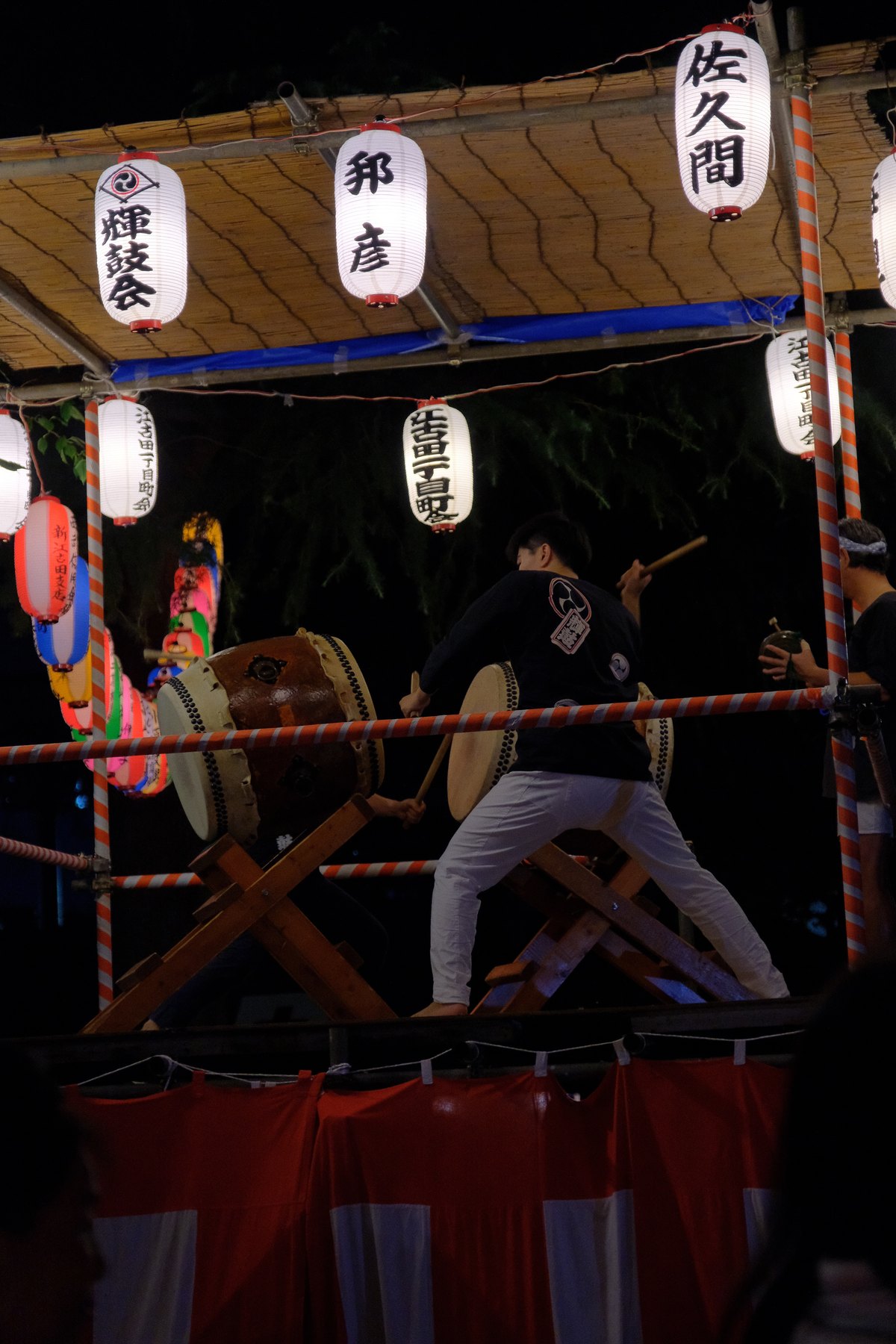
Search results often present “Japanese colors” as a neat row of hex codes. That is convenient for design, but it can detach a color from dye, fabric, lacquer, poetry, status, season, and the light in which it was seen.
For photographers, copying a swatch is less useful than learning relationships. Indigo behaves differently in cloth and evening shadow; vermilion carries a different role on a shrine gate than in a modern sign; seasonal greens change by plant, weather, and age.
Start with observed color, not a national formula
Japan contains saturated retail light, concrete, plastic, foliage, painted steel, old timber, cosmetics, uniforms, and countless regional craft traditions. A muted palette is one valid choice, not the definition of Japanese color.
Record the material and light with each color note: indigo-dyed textile in window light, wet asphalt under LEDs, young leaves in overcast weather, or lacquer reflecting a warm interior. Those conditions make the note usable.
Learn from seasonal combinations
Heian court dress used layered color combinations known as kasane no irome, linking dress to season and occasion. The lesson for photography is relational: a color acquires force through the layer beside it and the time of year it evokes.
Build small pairs rather than collecting isolated swatches. Try pale blossom against weathered gray, young-leaf green against dark indigo, or warm shop light against blue-hour sky—only when those relationships occur in the scene.
Treat indigo, vermilion, and green as materials
Natural dyeing shows that named colors are made through processes, not selected from a digital picker. Indigo can combine with a yellow plant dye to produce green; repeated dyeing, fiber, age, and light affect the result.
Expose to keep texture in dyed cloth and painted surfaces. Avoid pushing saturation until distinct reds or blues collapse into one digital color. In Lightroom, use targeted HSL adjustments only after checking the object under believable white balance.
Create a five-color field palette
During one walk, collect five photographed colors: a dominant environmental color, a living seasonal color, a human-made accent, a neutral material, and the color of the ambient light. Save the frames together rather than sampling random pixels from unrelated images.
Back in Lightroom, compare the set in grid view. Reduce the color that shouts without narrative purpose, protect the accent that guides the eye, and let the neutral retain subtle variation. The goal is a coherent encounter, not compliance with a predefined chart.
Translate the palette into a reusable edit
Choose a profile first, then establish tone and white balance. Use the curve for overall structure, HSL for specific material colors, and Color Grading for a restrained relationship between tonal regions. Leave exposure and local masks responsive to each photograph.
Test the edit on skin, foliage, daylight, interiors, and night. Camera profiles render the same settings differently, so verify on every camera represented in the trip. Save only the decisions that remain useful across the group.
Sources and further reading
References for the context and techniques discussed in this field note.